10 Questions with William Morris III
Born in 2001 in Brooklyn, New York, William Morris III has a bachelor’s degree in fine arts from the Art Academy of Cincinnati (2020-24) with a background in illustration. He is currently a graduate/master's student and professor at the University of Louisville (2025). An additional role given by the university is serving on the gallery committee, which includes planning, designing, and installing exhibitions. William served as a teaching assistant at the Art Academy of Cincinnati in a class integrating illustrative techniques and design principles, and he has been an artist-in-residence at the Cincinnati Art Museum in December 2024. In the following year, 2025, he was awarded a gallery fellow at ArtWorks, a mural studio in Cincinnati, Ohio.
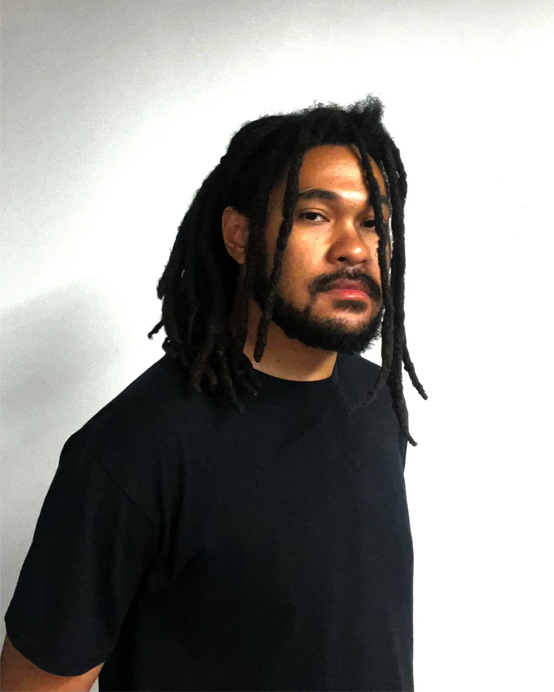
William Morris III - Portrait
ARTIST STATEMENT
Achieving feelings of nostalgia of the Y2K era and creating powerful compositions with red, black, and white, Will creates dialogue surrounding tools of capitalism as they affect identity, relationships, and politics. His designs on matte print present bodies in distorted shapes, stark contrast and text serving as dialogue. Along with the two-dimensional work, he operates as a sound artist, being influenced by electronic and hip hop, adding an atmosphere, amplifying the narrative through mechanical and fast-paced movement.
Working with stock images and San serif fonts, highlighting the warping and instability of individuality in a post-social media era, as content and entertainment are curated and informed by AI. Text allows the posters to be perceived as parodies of advertisements, most of which are in a muted manner. White figures in the designs serve as negative and positive space, showing emptiness in the narrative as subjects of intimacy, gambling, surveillance, and memory are extracted in day-to-day interactions with forms of technology.
The process of designing these posters aims to please human sensibilities in terms of replicating texture. Critiquing the digital landscape with digital work can be ironic, but providing silkscreen-like texture and a collage style brings the human spirit into the body of work. For composition, aiming for an asymmetrical, left or right heavy weighted in most instances adds uneasiness, providing realness to the concept at play.
god watches us, matte print, 24 x 18 in, 2026 © William Morris III
INTERVIEW
Let’s start with your background. You were born in Brooklyn but studied in Cincinnati. How have these different environments shaped your visual language and perspective?
Studying art in Cincinnati has allowed me to be closer to my influence, as it is a smaller environment than Brooklyn. Most of my peers and mentors from the area have an interest in illustration, this helped kick off my art career finding a passion for fantastical storytelling. It is one of the prominent cities in the United States in terms of mural art, and being illustrative was encouraged to me. There, I also built a studious nature to my practice. I interned and worked at the Cincinnati Art Museum and served in educator roles at the Art Academy of Cincinnati.
I have not engaged with the art world as much in New York City compared to Cincinnati, but the city landscape has been influential in my work and concepts. An urban landscape is geometrically rectangular with the abundance of buildings with a richness of diversity, reminding me to be open-minded about who or what I am projecting in my work. A more recent study of mine has been the Abstract Expressionism movement, which originated there. Last October, I did a research trip which included museums such as the Whitney and MoMA, getting to see works from that era in person. Themes of the sublime and existentialism were discovered during the movement; those ideas are thought about in my current body of work as what divinity looks like in a contemporary world, especially in a post-social media society where artificial intelligence influences the world.

form of entertainment, matte print, 28 x 22 in, 2026 © William Morris III
Your background is in illustration. At what point did you feel the need to move beyond it or challenge its conventions?
When I started this body of work specifically, in the first year of my master’s program, the urgency to develop my communication skills in my art was there. In my experience as an illustrator, narrative is important, but I was leading with expression; in reflection, there was not much of a design system developed in my practice. Last November, I began to lean into a graphic design route for my practice. By using text more often, following grids and systems more thoroughly, the work depicted the concept behind it more strongly and resonated more with the audience I was going for.
Being aware of the ethical use of technology has been ingrained in my mind because of the practice switch. From here, I began to learn music production from my interest in design, finding ways to integrate digital media in projects. I look forward to expanding my breadth in forms of art in the realm of digital media.
You work across both visual and sound practices. Do you see one as leading the narrative, or do they develop simultaneously?
As of now, my visual practice leads the narrative just because it’s my strong suit. This body of work is my first time working with sound. I will lean into it with more confidence when the experience gets up there.
In terms of producing my creative work, they are developed at the same time but are different thematically. The design work is the reaction and critique of a post-social media age, while the album connected to it serves as a background, fundamentally based on the hero’s journey.
Your use of red, black, and white is very deliberate. What draws you to this restricted palette, and what does it allow you to say that colour might not?
I have two specific inspirations behind this choice. Conceptually, when I was discovering colour palettes, close peers and mentors of mine reminded me to evaluate Barbara Kruger’s designs, where her most noticeable works are in red, black, and white. I believe she and I share a common goal of devoting our work to political discourse, which is why using those colours has become almost subconscious in choice.
Another reference is the Acid Design aesthetic, which originated in the 90s and is closely tied to rave culture. Compositionally, it was free with organic shapes in constant movement and uses black heavily for poster work. Motifs that are featured are abstract and futuristic themes, which connect with my subject matter choices. Studying the style, I found success with red, black, white and yellow accents.
I found the combination to demand a sense of urgency and force the eyes of viewers to move rapidly. It also adds a layer which includes the impending doom and danger that the posters portray.

metal sublime, matte print, 24 x 18 in, 2025 © William Morris III

the great bid, matte print, 24 x 18 in, 2026 © William Morris III
You reference Y2K nostalgia. What interests you about that era beyond aesthetics?
For me, it’s the idea that society once envisioned the future in an optimistic, naïve way, not too long ago. In the late 90s to early 2000s, advertisements were mostly in this light blue tint with blurred movement, with minimalistic technology being shown off.
This way of thinking is different nowadays, in my opinion. Surveillance, selling personal data, and gambling are so normalised that the future cannot be seen in a dreamy manner. The complexities of technology play a role as well; there are immediate consequences if one behaves or operates in a way on a platform or accesses a software’s features.
It is more important to criticise capitalism, but the delivery can be seamless if it’s a parody of it, mimicking advertisements.
Your works often resemble advertisements. Are you more interested in critiquing capitalism or mimicking its visual language from within?
Unfortunately, the aesthetic of Y2K advertisements is engaging and pleases the eye, but it is a good reminder that all art is propaganda. Using advertisements can be a productive way of creating dialogue about the wrongdoings of capitalism.
You incorporate stock images and sans-serif fonts, as you mention in your statement. How do you choose when an image or piece of text feels “right” for a composition?
The qualification of the images is that they need to be interesting compositionally and have a strong ability to be original, unrecognisable from the source once they are edited.
Subject matter in this body of work must show ownership, yet a need for soul. Most of the figures in this series are made up of sculptures and mannequins with actual faces on top. Also, with the figures being white or a shadowy black, it creates an ominous feeling, amplifying themes such as surveillance.
The choice of font is directly tied to my aesthetic choices, as thin, sans-serif fonts dominate the advertisement landscape in the early 2000s. With this choice, a hierarchy is established between texts and images, allowing the images to hold more weight.

infinite memories infinite pain, matte print, 28 x 22 in, 2026 © William Morris III
There’s a tension between digital critique and handcrafted texture in your process. How conscious is this contradiction when you’re working?
There is a high awareness when it comes to the texture and human-like qualities, compared to digital critique. Having posters with halftones and effects that mimic silkscreen informs the viewer that a human connection can be made, and the image is not phoney.
Generative images, which are thought about in my critique, have a certain feeling and look. There is a lack of expression, leaving the created content to be ‘average’, looking awkward in manner and stylisation. There is a fundamental essay I have read to inform me of this decision-making. Mean Images by Hito Stereyl gives an explanation of the average look of generated content, how it uses the mean or average of a specific group of people. Because of reading this, I strive for authenticity in presentation.
You explore themes like surveillance, intimacy, and identity in your work. Do these emerge organically, or do you begin with a conceptual framework?
My designs can begin organically, usually being reactionary to the environment around me. For a topic such as surveillance, I was reflecting on the accessibility of using cameras to watch others for safety and political action. I live on campus at my university, drones have been a way to record facial recognition and neutralise actions such as rallies and protests. Tools with cameras and video functionality for that purpose are easily accessible.
Identity is a huge topic in my current body of work; the current digital landscape reinforces shifts in the way we think, dress, and carry on in our day-to-day lives. Users on social media can change the algorithm, also vice versa, at the same time. This creates the illusion of collective thinking. Yes, everyone has distinctions in thought and expression, but algorithms reinforce society to put things into categories.

a face without a face, matte print, 24 x 18 in, 2026 © William Morris III
Lastly, as someone already teaching and involved in institutional roles, how do you see your practice evolving? Are you aiming more toward academia, exhibitions, or something in between?
Working in institutional roles has allowed me to continue my research in futuristic visual aesthetics and contemporary discourse with various resources. The sources of my research are used as a backbone, reinforcing design choices for projects. Being in these roles gives me more access to technology, which I see evolving my practice. Immersing myself more in digital media is in my future. For example, installation work is a practice I am currently investing my time researching.
My career goal aims to find a balance between academia and exhibitions. I see myself as a lifelong student, mentoring others and constantly learning, but I still want my voice to be heard as a practising artist and exhibit in public spaces. Also, working in exhibition spaces allows me to give other artists a chance to have their message heard. I believe my journey in the arts revolves around communication and good faith.
Artist’s Talk
Al-Tiba9 Interviews is a curated promotional platform that offers artists the opportunity to articulate their vision and engage with our diverse international readership through insightful, published dialogues. Conducted by Mohamed Benhadj, founder and curator of Al-Tiba9, these interviews spotlight the artists’ creative journeys and introduce their work to the global contemporary art scene.
Through our extensive network of museums, galleries, art professionals, collectors, and art enthusiasts worldwide, Al-Tiba9 Interviews provides a meaningful stage for artists to expand their reach and strengthen their presence in the international art discourse.