10 Questions with KR Windsor
KR Windsor is a digital artist and printmaker whose work investigates the unstable intersection of written language and image. Merging photographic texture, digital painting, and typographic abstraction, he creates limited-edition works on paper that transform letterforms into reflections on how language shapes and distorts our shared perceptions, exposing the complex relationship between symbol, meaning, and truth.
Typography functions as both medium and muse in KR’s work. Having worked in more than 35 countries, he draws inspiration from the material and cultural diversity of written forms as an evolving archive of human expression. His investigations consider the written mark as an artifact, the veiled interface between the visual and the semantic, the personal and the collective.
Recent exhibitions include juried shows at Amos Eno Gallery in New York, Cape Cod Museum of Art, Center for Contemporary Art in Abilene, Texas, Maryland Federation of Art in Annapolis, and the University of North Carolina’s Pembroke A.D Gallery.
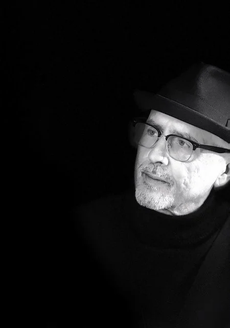
KR Windsor - Portrait
ARTIST STATEMENT
Writing is both a technology and a mirror, encoding thought even as it distorts it. Typography, for KR, is not only a vessel for meaning but a field of interference, where language is visualized, objectified, and reconsidered through form. His work probes the tensions that arise when words are separated from their function, when meaning fractures under the weight of misuse or its own representation.
KR’s work explores the spaces where words lose their footing: the shadows between language and perception, the ruptures where communication becomes misdirection. Through these inquiries, he examines how written systems that evolved to unify human thought now equally serve to conceal, manipulate, and destabilize.
Employing layered photographic filters and saturated chromatic fields drawn from digital culture (never AI-generated), he reimagines the written mark as both evidence and transmitter, an imperfect echo of human ambition, ambiguity, and invention. His process is a kind of visual archaeology, unearthing the silent authority of words and mapping the consequences of their power.
After Strange Gods, Digital painting; giclée print on archival paper (1/10), 40 x 30” | 1016 x 762 mm, 2025 © KR Windsor
INTERVIEW
First of all, can you share a bit about your background and how your early fascination with alphabets and letterforms began?
My passion for letterforms and typography started in my childhood when I would copy typefaces and logos from books in my local library. I remember getting lost in the intricate forms and the worlds that they contained. This early fascination developed into creating my own letterforms and pursuing my artistic aspirations through contributions to my high school newspaper.
You studied design and typography at Bezalel Academy of Art and Design and Cranbrook Academy of Art. How did this education shape your artistic approach?
For an American, studying abroad in the late 70’s was a profoundly different experience from our highly interconnected world today. Words, images, and type carry a different level of significance when distance is a magnification factor, whatever the cultural context. Also, my experience of European heritage through a Middle Eastern lens gave me a multifaceted way of seeing the world and a richer visual vocabulary.
I was fortunate that my undergraduate and graduate studies coincided with several technology shifts in the world of typography and printing. My early studies at Bezalel included setting metal type by hand, letter by letter. It felt like I was working at a molecular level, gaining a deep understanding of the technical and aesthetic aspects of letterforms. Added to this was learning how to design concurrently with English, Hebrew, and Arabic type. The experience with Roman and Semitic alphabets at this early stage in my training added a completely new dimension to my thinking.
The next shift in the world of type was the transition to digital type, which was happening during and after my studies at Cranbrook. This dramatic shift opened new design possibilities that were unimaginable using metal type. The conceptual stimulation that Katherine and Michael McCoy, the department co-chairs, brought to our studies was also transformational. Much of this was through interaction and projects with visiting artists and designers, such as Daniel Lieskind, Wolfgang Weingart, Mario Bellini, and Frank Gehry. The integration of so many disciplines into my learning experience, photography, architecture, fiber, product design, and more, gave me a richer understanding of the visual and ideological layers that could be created through image and type.
With the advent of the first Macintosh just after I completed my studies, I was smitten by the possibilities of typography and technology. The postmodern and punk scene in New York, where I was living, was another huge influence on my visual sensibilities toward type and image.

The Tears of a Hundred Million Children, Digital collage; giclée print on archival paper (1/10), 32 x 24” | 812 x 609 mm, 2025 © KR Windsor
Writing and the letterform are central to your work. What continues to draw you to typography as both subject and medium?
In everyday life, we barely give thought to the notion of writing. But without this 3,000-year-old technology, civilized society would not exist. It is mind-blowing that humans took meaningless visual marks and, through societal agreement, ascribed specific sounds and meaning to them. Embedded in these marks are stories that make us who we are and that have shaped the world as we know it.
Where my art takes off is in exploring the gaps between those visual marks and what they stand for, the hidden meanings that emerge from these stories, the misunderstandings (both good and bad) that disrupt the relationship between humans, institutions, and cultures.
My continuing fascination with letterforms exists on a few different levels. One is the formal aspect, deconstructing the architecture of each letterform and exploring the magic that emerges from it. Another is examining the historical aura that letterforms project; for example, the outrageously embellished type styles of Victorian England clearly identify the spirit of that era. The immediately recognizable “Bismillah” in Arabic calligraphy carries a spiritual halo; the stories of Jewish mysticism seem to emanate from Hebrew letters. A third level is the duality of meaning that a written word may have, which can be a source of transcendence or deceit, depending on its rendition. All or some of these levels are stimulants for the development of each piece I work on.
Your practice explores the tension between visual form and semantic meaning. How do you navigate this balance in your work?
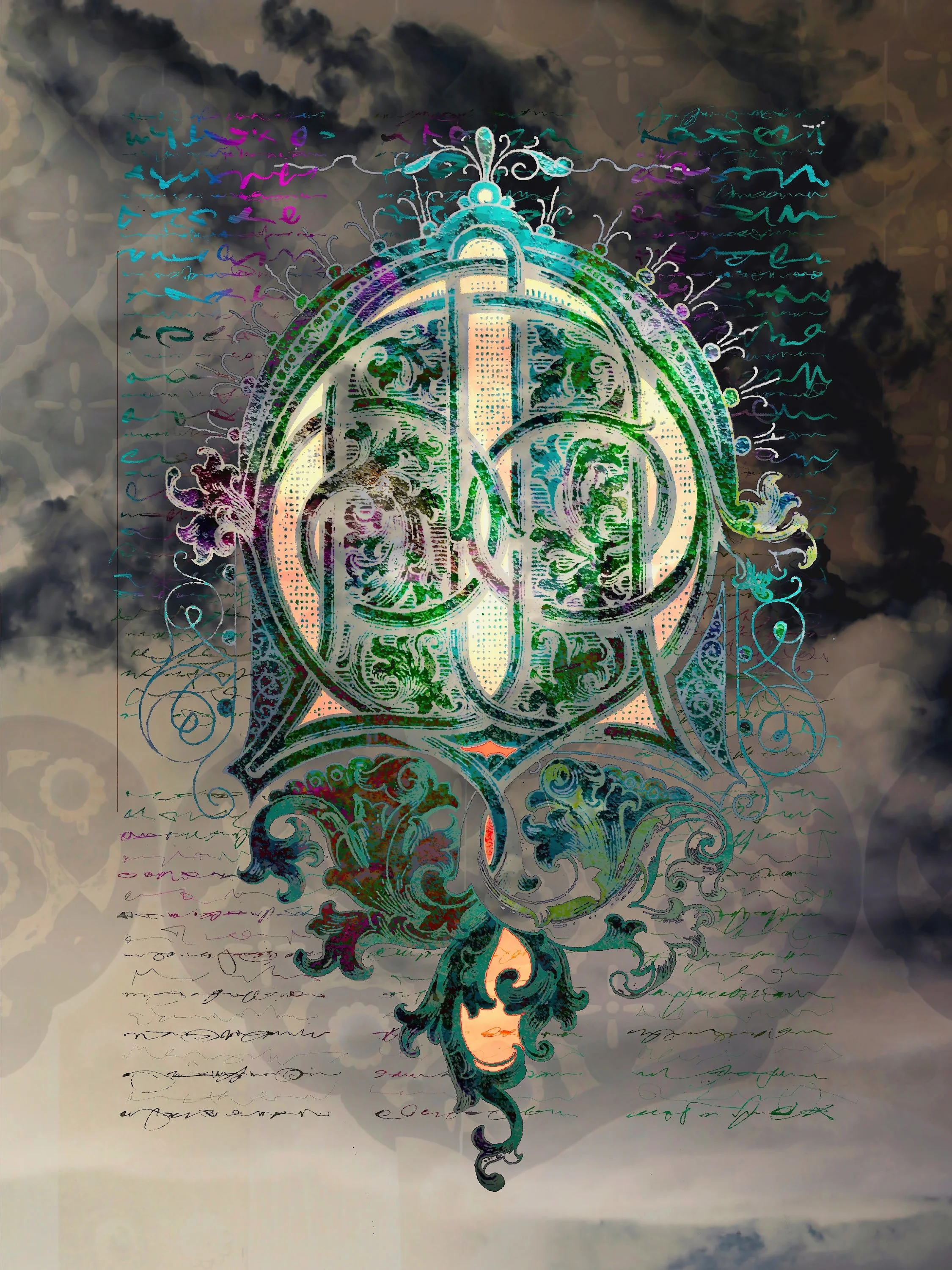
Balancing the tension between form and meaning in art is a function of process. It may sound a bit magical, but in some respects, my work creates itself. I am only the implementer following the lead of the work as its journey or story unfolds. It may start with a letterform, as it did with “After Strange Gods,” which then revealed itself as a visual polemic against antisemitism. Or “The Last Vision of Bishop Eidfrith (in the Chapel)” which evolved into an homage to one of the greatest works of Medieval illuminated art.
In other cases, the work may start with one of my photographs, such as the detail of the East Gate of Nijo Castle in Kyoto in “The Tears of a Hundred Million Children”. This work then morphed into the story of Edo-period children in Japan forcibly separated from their parents. The Japanese text in front of and behind the screen, written in 1665, is taken from a letter written by an exiled child asking for help, transforming this piece into a representation of a recurring tragedy throughout history.
Another example is when an old, well-known American folk tune found its way into a work that came out of my response to the tragedy in Gaza. (“This Land is Your Land”). This is about allowing the emotional frequency of words to bounce between what we see and what we feel to elevate our sensitivity and hopefully, empathy.

Let Us Pr(ai)y, Digital painting / collage; giclée print on archival paper (1/10), 32 x 24” | 1016 x 762 mm, 2025 © KR Windsor
The Last Vision of Saint Eidfrith (in the Chapel), Digital collage; giclée print on archival paper (1/10), 32 x 24” | 812 x 609 mm, 2025 © KR Windsor
You often examine the darker “shadows” of written language, such as misappropriation and distortion. Why is this important to address today?
Words have extraordinary power. The shadows they cast often come from their misuse, or attempts to manipulate people, or from double meanings that breed uncertainty. Today, more than ever, we must be aware of the damage that the misuse of language causes, such as destroying the freedoms we have. This is especially true when those in government use the written word to concentrate their power through autocratic language. My work uses direct and indirect ways to explore this, such as my work “Modern Truth,” which started as an exploration of Victorian typefaces but then evolved into a metaphor for the distortion of truth in our world today. It is tragic that the written world’s dereliction of duty, our failure to push back on that manipulation, has widened the chasm between words and their meaning. My work often gravitates toward simply trying to shine a light on it, elevate our awareness to the misappropriation of words and deliberate obfuscations that have become stains on society.
Your work references both historical scripts and contemporary media landscapes. How do past writing systems inform your response to the present?
One area I have pursued is creating synthetic letterforms that mimic our alphabet as a way of exploring the inner worlds of these systems without being burdened by the meaning we’ve given them. One example is my project “Codex Nabataea”, an alternative typographic history set in the period before the Roman annexation of Petra in 106 CE. Most scholars agree that the emergence of the Arabic script came from Nabataean Aramaic. However, with the lack of significant historical evidence, there are gaps in our knowledge about this transition. The visual letterforms in this project fill that gap. This fictional alphabet imagines Nabataean royalty waging a culture war against the linear thought and engineering-mindedness of the Romans, using typographic forms that emerged from the transition from stone carving to reed writing on papyrus. This project is one where I have set my digital tools aside and worked purely with pen and ink and other materials in keeping with the manual mark-making of this story.

Weather Report, Day Zero, Digital collage; giclée print on archival paper (1/5), 36 x 24” | 914 x 609 mm, 2025 © KR Windsor

Four Score, Digital collage; giclée print on archival paper (1/10), 40 x 30” | 1016 x 762 mm, 2025 © KR Windsor
Color plays a strong role in your compositions, echoing the intensity of online media. How do you use color to reinforce your ideas?
Color in today’s world is a drug. Our increasing consumption of color from projected light (phones, tablets, computers, etc.) versus reflected light (paper and other physical surfaces) has rewired our brains and changed how we experience reality. The higher intensity, more direct input creates a vibrancy that demands a higher level of attention. It creates a stronger emotional and sensory engagement that is more mesmerizing than the “logical, ambient information” from reflected light. While the output of my work is on a reflected surface, I employ vibrant colors to mimic this changing experience of reality. My use of high-quality art papers such as Hahnemuhle Photo Rag 308 for my digital prints is important for achieving this.
How have audiences and viewers responded to the conceptual and critical nature of your work?
I have been pleasantly surprised at the reception. Works that have a more critical viewpoint, such as “After Strange Gods”, “Identity Crisis”, and “This Land is Your Land” have been accepted into group exhibitions and publications that I did not expect. For me, this is a validation of relevance and appeal. I realize that, for example, my work “After Strange Gods” carries some challenging ideas. But the fact that I am getting a positive response to this kind of work may speak to the times we live in and the desire for filters that help us make sense of the written world around us.
Having worked as a designer and strategist in more than 35 countries, how has this global experience influenced your artistic vision?
I am privileged to have experienced such a breadth of culture and geography. Two things stand out for me, especially as my love and knowledge of typographic forms have matured. The first is the universality of the human experience, which points to our ability to relate to each other regardless of how different our language or politics might be. A large swath of the world’s scripts, the Roman alphabet, Arabic, Armenian, Coptic, Hebrew, Russian, Sanskrit, and more, descend from the same origin point. To me, this speaks to that universality. This ultimately finds its way into my work, as the development of each piece unfolds and gravitates to an aspect of this experience that has significance across cultures. “The Tears of a Hundred Million Children” is a good example.
The second point is that every culture and script has idiosyncratic elements different from anything else we know. We can learn from the beauty of this uniqueness. The Arabic script is a good example: it has context-dependent letterforms that create a unique harmony, is all “cursive”, has a higher level of phonetic precision, yet has no capital letters. The simplicity of the flowing, connected forms speaks to an elegance and adaptability that we all aspire to.

I Am Not Myself, Digital collage; giclée print on archival paper (1/10), 32 x 24” | 812 x 609 mm, 2025 © KR Windsor
Lastly, what projects are you currently working on, and what directions are you interested in exploring next?
One idea I am exploring relates to the American semiquincentennial (250th anniversary). Specifically, I am looking at the gap between the values that shaped American culture versus what defines it today. It’s a difficult theme to pursue without falling into platitudes, but I’m hoping it leads me into some rich territory.
One area lurking in the back of my mind is adding media to my work to strengthen impact. “A Presidential Abecedary” is an example where I have taken a simple educational tool and combined it with the darker side of what is happening in the US today. So, for example, by adding a recording of a child singing the “ABC song” to the piece, I imagine it would ramp up the emotional tension significantly. I’ll be looking at ways to introduce temporal or other media into my work. Another area I’m exploring is adding quirky or surrealist humor into my work. My pieces “Night Bell, “In the Event of,” and “Birding in the Afterlife” are a start in this direction. They all relate to common human experiences….in the afterlife.
Artist’s Talk
Al-Tiba9 Interviews is a promotional platform for artists to articulate their vision and engage them with our diverse readership through a published art dialogue. The artists are interviewed by Mohamed Benhadj, the founder & curator of Al-Tiba9, to highlight their artistic careers and introduce them to the international contemporary art scene across our vast network of museums, galleries, art professionals, art dealers, collectors, and art lovers across the globe.