10 Questions with Rui Wang
Al-Tiba9 Art Magazine ISSUE19 | Featured Artist
Rui Wang is a cross-disciplinary designer and creative artist working across visual design, art direction, and photography. Holding an MFA in Advertising from the Savannah College of Art and Design, his work blends aesthetic precision with narrative depth. He creates emotionally resonant visual systems for branding campaigns, multimedia, and photography. Rui's creative philosophy, that every visual is a vessel for storytelling, shapes both his design and photographic practice. He approaches each project as a narrative, translating abstract ideas into emotionally resonant experiences through visual systems. From concept development to typography, layout, and motion, Rui builds visual stories across creative and multimedia platforms. In photography, he brings the same sensibility, capturing visuals imbued with narrative and feeling.
Rui has led and contributed to campaigns for global brands including Disney, Nike, and SCAD. His work has been recognised by institutions including Red Dot, the MUSE Creative/Design Awards, IDA, and IPA, among others.

Rui Wang - Portrait
Not Everything Was Seen | Project Statement
Not Everything Was Seen explores absence as a form of presence, and love as something that resists full visibility. The images do not act as evidence, but as traces, fragments left by intimacy and time. Love lingers in gestures, silence, and fading light. Each frame suggests what is deeply felt but never fully seen. Each frame gestures toward something just beyond the visible. Love is there, but not always in focus. It flickers in reflections, hides in silence, slips out of frame. This series doesn't aim to show everything; it holds what remains.
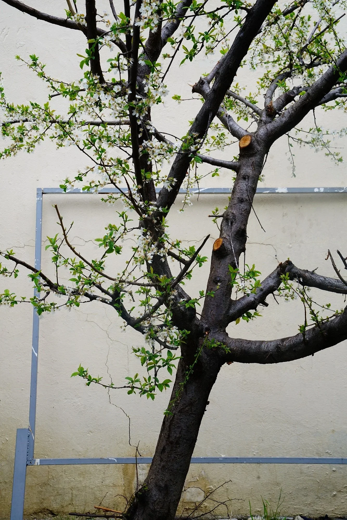
Not Everything Was Seen, Analog Photography (35mm color film), 8x12 in, 2024 © Rui Wang
AL-TIBA9 ART MAGAZINE ISSUE19

DISCOVER THE INTERNATIONAL ART SCENE WITH AL-TIBA9
LIMITED EDITION | Shipping worldwide from Oct 12th.
Premium museum art paper.
Printed in London.
Grab 3 or more prints and get your FREE digital magazine.

Get your limited edition copy now
INTERVIEW
You work across visual design, art direction, and photography. How did your creative journey begin, and what led you to embrace such a cross-disciplinary practice?
I was born and raised in Taiyuan, China, where I first learned traditional painting and calligraphy. That early discipline, with its attention to line, rhythm, and negative space, set the tone for how I see. I later studied Public Art, which trained me to think conceptually, work with space, and consider the audience as part of the work. After moving to the United States for an MFA in Advertising at the Savannah College of Art and Design, I began to merge strategy with story. Around the same time, an elective introduced me to analogue photography, which became a slower, more observational way to study light, mood, and atmosphere.
I didn't adopt "cross-disciplinary" as a label; the ideas led me there. When a story needs structure, I build systems in typography, layout, motion, and brand architecture to carry the narrative with clarity. When it needs breath, I turn to images that work through light, grain, and sequence to hold ambiguity and feeling. Art direction stitches those modes into one experience. Whatever the medium, I start with a feeling and design the form that can carry it, whether a campaign, an identity, or a photographic series.
As a cross-disciplinary designer and creative artist whose work spans visual design, art direction, and photography, I let the two halves of my practice feed each other: design gives coherence; photography gives breath. The balance between structure and sensitivity is where my work lives.

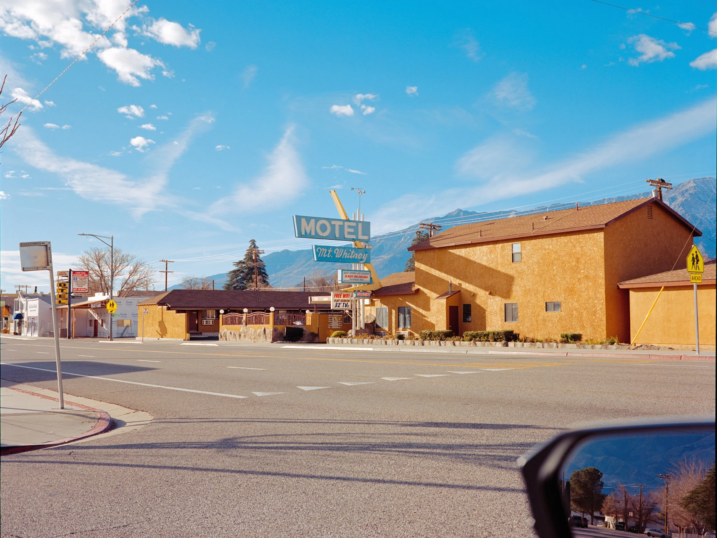
I Saw Myself Elsewhere, Analog Photography (35mm color film), 8x12 in, 2025 © Rui Wang

What Hides in Light, Analog Photography (35mm color film), 8x12 in, 2025 © Rui Wang
Your philosophy frames every visual as a vessel for storytelling, as you mention in your statement. How does this approach translate differently in your design projects versus your photography?
I see every visual as a vessel for a story, but each medium carries that story differently. In design, storytelling is built and directed. I start with the outcome I want the audience to feel, then translate it into a creative platform and campaign idea, followed by structure: concept lines and messaging, typographic hierarchy, colour logic tied to meaning, grid and layout pacing, motion behaviours, and image direction. On campaigns, I partner with copy, strategy, and production to keep the narrative consistent across touchpoints, from key visuals and motion spots to product pages and social. The aim is clarity that still feels human, so the system scales without losing tone or intimacy.
In photography, storytelling is discovered rather than constructed. I work slowly with analogue film, walking the city, coastline, or trails, letting light and timing suggest what the image wants to be. I pay attention to small transitions, the way a gesture changes a scene, how silence sits in a frame. The narrative is shaped later through editing and sequencing: contact sheets, pairings, recurring motifs, pauses between images, and scale on the page or wall. I trim language to a minimum, using titles sparingly, so negative space and rhythm can hold the meaning.
Both modes inform each other. Photography gives my design work palette, pacing, and restraint; design gives my images structure, coherence, and an editorial sense of flow.
You've worked on campaigns for global brands like Disney and Nike, as well as on independent projects. What's your process when developing a new series or design work? How do you go from the first idea to the outcome?
I use a similar method for both brand work and design systems: begin with feeling, end with form. I start by writing a short north star sentence about the emotional outcome I want the audience to carry. Then I research references, language, and context, and sketch three or four creative territories to test tone rather than just appearance. From there, I translate the intent into a creative platform and a kit of parts: concept lines, typographic hierarchy, colour logic tied to meaning, grid and layout pacing, image direction, and a motion language. I prototype early with key visuals, short motion studies, and landing screens to see how the story reads across channels. Working with strategy, copy, and production, we iterate until the system feels both clear and alive. The final deliverable is more than assets; it is a playbook with usage rules, examples, and behaviors so the work can scale without losing tone.
For independent series, the path is slower and more observational. I walk and shoot on analogue film, letting light, timing, and small human gestures suggest the images. I keep field notes, then edit in passes: first for instinct, then for structure, then for nuance. Sequencing does the narrative work through pairings, recurring motifs, rests between images, and decisions about scale on the wall or page. I build a book dummy or exhibition map to test rhythm in space, add minimal text only where it deepens the read, and trim everything that does not serve the feeling. Across both modes, the aim is the same: define the emotion, design the system that carries it, and refine until only the essential remains.

Where I Begin to Disappear, Analog Photography (35mm color film), 8x12 in, 2024 © Rui Wang
In Not Everything Was Seen, absence becomes a central presence. What inspired this photographic series, and how did you approach the challenge of capturing what resists visibility?
The series began with a simple question: how do we feel what we cannot fully see. During a period of personal transition and distance, I kept noticing small traces of presence, the way a room holds someone who has just left, or how light remembers a touch. I wanted to make a body of work about that residue, about love and memory that stay even when the figure is partial, hidden, or gone.
I worked slowly with analog film and photographed at thresholds, places where seeing is uncertain. Dusk, doorways, windows, reflections, glass, curtains, and the edges of rooms became recurring sites. I framed subjects so that they were only partly revealed, allowed blur and grain to remain, and used negative space to convey feeling. I paid attention to gestures rather than faces, to atmosphere rather than description, to what sits just outside the frame.
In sequencing, the narrative emerged. I built rhythm from contact sheets through pairings, recurring motifs, and quiet pauses between images. Colour stayed restrained, and text was kept minimal so pacing and scale could lead the read. When I present the work, I offer only a title and a brief note, avoiding didactic captions. I want viewers to think with the images, to complete the story with their own memories and interpretations.
The series evokes love through suggestion, reflections, silence, and fragments. What role does editing or sequencing play in constructing that emotional rhythm across the photographs?
Editing is where the series finds its voice, and sequencing is the choreography of its emotion. I begin by living with small prints and contact sheets on the wall, moving images until a felt arc appears. The first pass is instinct, the second is structure, the third is nuance. Anything that explains too much is removed, and anything that repeats without adding resonance is cut.
Pacing is also built with scale and adjacency. A small image invites intimacy; a larger one releases tension. Left and right pairings set up dialogue, and the turn of a page becomes a kind of inhale and exhale. Colour stays restrained so tone carries feeling, and the sequence moves from dusk to night to deepen the sense of time. Text is minimal, usually only a title and a brief note, so the gaps remain open. For viewers who look closely, there are threads linking one image to the next: a colour that carries forward, a recurring back view or silhouette, a tilt of light echoed later at a different scale. The goal is not to tell the viewer what to feel, but to create a path where feeling can happen.

We Waited for the Light to Leave, Analog Photography (35mm color film), 8x12 in, 2025 © Rui Wang

You Were Just Here, Analog Photography (35mm color film), 8x12 in, 2024 © Rui Wang
Whether working in visual design or photographing still images, your work often feels poetic and emotionally layered. What themes or feelings do you return to?
The themes I return to are grounded in my earlier practice and lived experience. A lot of it goes back to childhood. Learning traditional Chinese painting and calligraphy trained my eye to value line, rhythm, balance, and negative space. That early discipline made me sensitive to restraint and stillness, and I keep returning to those qualities. I am drawn to thresholds and in-between states, to presence that feels slightly distant, to tenderness held with care, and to memory that lingers more as a trace than a statement. Reflections, silhouettes, the edges of rooms, dusk light, and ocean fog are recurring motifs because they hold emotion quietly.
In visual design, these feelings translate into rhythm and clarity: typographic cadence, measured pacing, generous negative space, a held palette, image direction that suggests rather than declares, and motion used sparingly as breath. In photography, they become walking with a film camera, letting light and timing decide, then using editing and sequencing to shape subtext. Across mediums, I aim for clarity without overexplanation, work that carries a mood, invites reflection, and leaves room for the viewer to enter.
Typography and layout are key to your design work. How do you use these tools to build not just structure but emotion in your visual systems?
Typography and layout are the voice and the breath of a system. I begin by naming the tone I want the audience to feel, then translate that into hierarchy, rhythm, and space. The grid sets tempo, white space becomes silence, and scale sets the emotional register. I think of a page or screen like a score: accents, rests, and phrases that carry the story forward.
Typeface choice is the first emotional decision. A humanist Sans with open apertures feels warm and conversational. A Grotesk can introduce tension and modernity. A Serif with gentle contrast can evoke memory and intimacy. I modulate feeling through weight and scale for emphasis, leading and letterspacing for openness or urgency, and line length to control pace. Careful rags, optical alignment, and a restrained palette keep the voice clear. Layout builds closeness or distance through column width and proximity, and uses negative space to let the reader breathe.
In systems work, I codify these choices so emotion is repeatable. Headline, subhead, body, captions, and annotations each have defined roles and behaviours across print, product, and motion. When type moves, easing and dwell times act as pacing rather than spectacle. Image direction and typographic voice are designed together so photographs carry mood while type carries meaning. The result is a structure that reads easily and a tone that lingers, which is the same aim I have in photography: clarity without over explanation and a path for feeling to surface.
You move fluidly between commercial and personal work. How do you maintain your artistic voice across such different contexts?
I treat voice as a point of view and a method, not a look. Before any project, I write a one-sentence north star about the feeling I want the audience to carry.
In commercial work, I start with strategy and research, run workshops, then turn insight into a creative platform and system: typography, a restrained palette, grid and pacing, motion as breath, image direction. I set a few non-negotiables such as clarity, generous space, typographic cadence, and honest photography.
In personal work, I slow down and look closer, walk with a film camera, embrace ambiguity and imperfection, then shape subtext through editing and sequencing.
Design and photography fill my life and feed each other. Design gives structure, clarity, and editorial flow; photography gives mood, timing, and breath. Together, they keep my voice consistent across very different contexts, and they remind me that form should always carry feeling.

Not everything was seen © Rui Wang
Are there specific mediums or collaborative formats you'd like to explore more deeply in the future?
I would like to go deeper into the photobook as a medium, especially editions that combine editorial design, sequencing, and quiet text. Bookmaking feels natural to my practice because it merges system and story. I am interested in collaborating with independent presses and trying print methods such as risograph, letterpress accents, and darkroom or pigment printing to explore texture and tone.
I am also drawn to time-based work that combines visuals with music or sound. Short moving image pieces that use typographic pacing, restrained motion, and original soundscapes could extend my language into film. I would welcome collaborations with composers or sound artists to explore how sound shapes mood, timing, and the emotional reading of images.
Lastly, looking ahead, what are you currently working on, or what kind of stories are you hoping to tell next?
I am currently preparing to publish my photobook: Not Everything Was Seen. I'm refining the edit and sequence while testing papers and printing methods, and I feel both confident and excited to bring it into the world. In parallel, I'm developing new projects for upcoming design and creative competitions as a way to push my craft, test ideas, and grow. Looking ahead, I want to keep telling stories about memory and tenderness in everyday life, where the city meets nature and presence meets absence. For updates and new work, please visit my website and Instagram.
Artist’s Talk
Al-Tiba9 Interviews is a curated promotional platform that offers artists the opportunity to articulate their vision and engage with our diverse international readership through insightful, published dialogues. Conducted by Mohamed Benhadj, founder and curator of Al-Tiba9, these interviews spotlight the artists’ creative journeys and introduce their work to the global contemporary art scene.
Through our extensive network of museums, galleries, art professionals, collectors, and art enthusiasts worldwide, Al-Tiba9 Interviews provides a meaningful stage for artists to expand their reach and strengthen their presence in the international art discourse.