10 Questions with Yinxue Zou
Graphic designer and educator Lucy Zou specialises in branding, typography, and visual storytelling. She received her MFA in Graphic Design from Boston University and studied Interior Architecture as an undergraduate. In branding and design communication, Lucy is interested in looking at work across print, digital, and physical platforms to create legible and distinct systems.
She is invested in projects that work with cultural institutions, public systems and histories, and cross-cultural contexts. Some recurring themes she thinks through in her work include notions of interpretation, navigation, and understanding, and how the visual language around things can impact how we experience them. Lucy’s work has been internationally recognised by design awards, including the Indigo Design Award, featured in magazines and online publications, and exhibited.
Yinxue Zou - Portrait
ARTIST STATEMENT
Graphic designer Yinxue Zou works primarily in visual systems, translating ideas and building components into diagrams and legible structures. Oscillating between the fields of identity design, publication design, and spatial communication, her work tends to blur boundaries of graphic design and environment.
More interested in the functionality of design than style, how design leads you, frames you, and boxes you in, she often takes on subdued conditions in her projects. Design in these instances needs to work harder to communicate. It is in these problems that she finds clarity, rhythm, and extreme delicacy to be strong drivers of her work. Her work plays with maintaining a system while experimenting with how a visual language can operate both within and outside of that system.
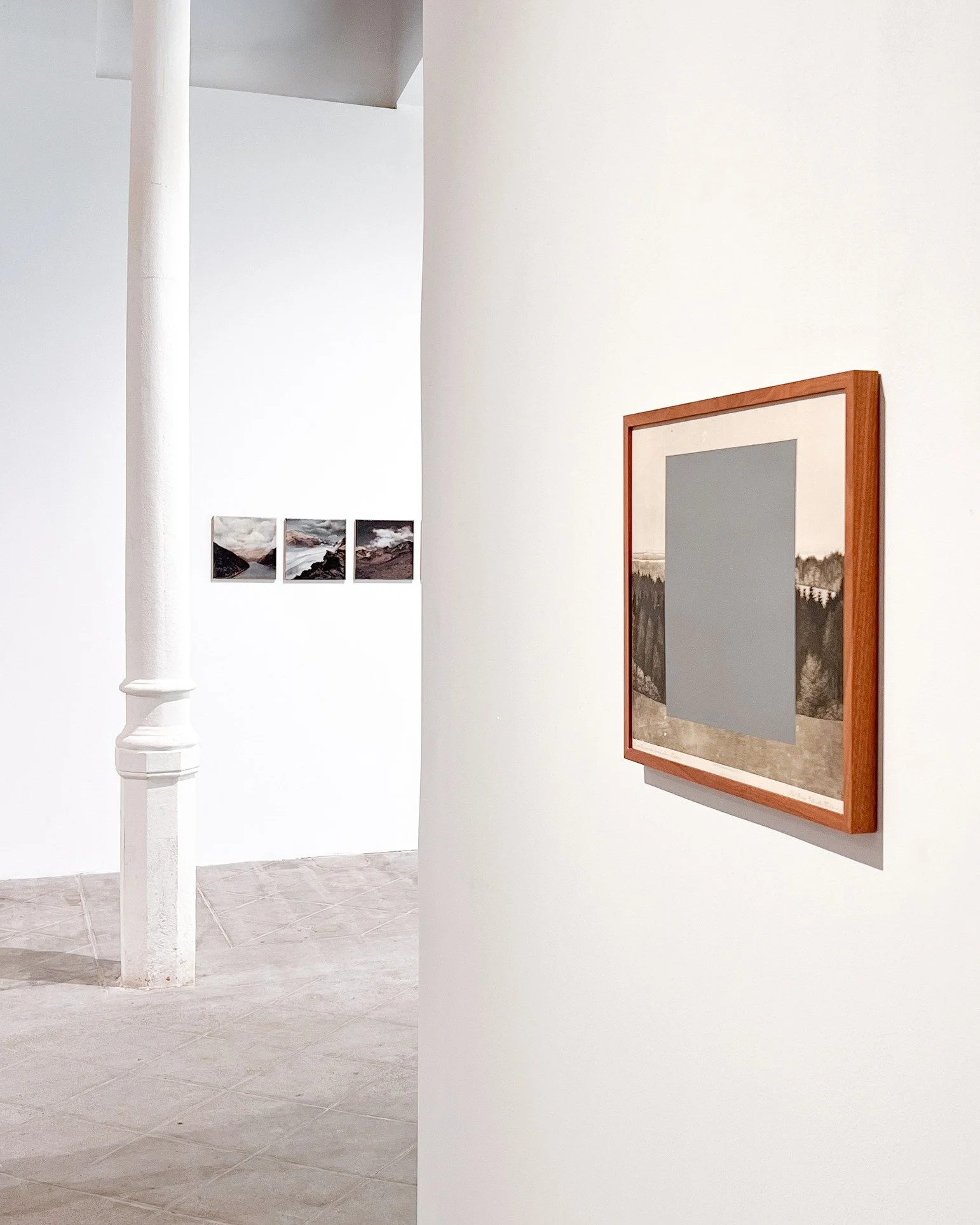
Glenstone Museum Identity, Environmental Graphics, Variable dimensions, 2026 © Yinxue Zou
INTERVIEW
First of all, you work across branding, typography, and visual systems. What drew you to graphic design as your primary medium, and why does it still feel like the right language for your ideas today?
I first became interested in graphic design because it lives between language, image, and system. It can convey information in very specific ways while also building emotion, atmosphere, and culture. Graphic design excels at taking an abstract idea and translating it into something visual that people can see, read, use, and share.
I have always been fascinated by the ways in which we access information. The reason content is inaccessible is rarely that it is inherently complex, but because it has not been intentionally arranged. Through the functions of typography, hierarchy, rhythm, grids, image treatment, and visual systems, I am able to restructure complex content and make it more understandable.
Because of these interests and strengths, I continue to work across branding, typography and visual systems. Branding creates identity, typography gives that identity a voice, and systems create order. My projects have been recognised internationally, including one Indigo Design Award Gold Winner, one Indigo Design Award Silver Winner, and one MUSE Design Awards Silver Winner. The awards help confirm for me that function, hierarchy and form can coexist rather than compete with each other.
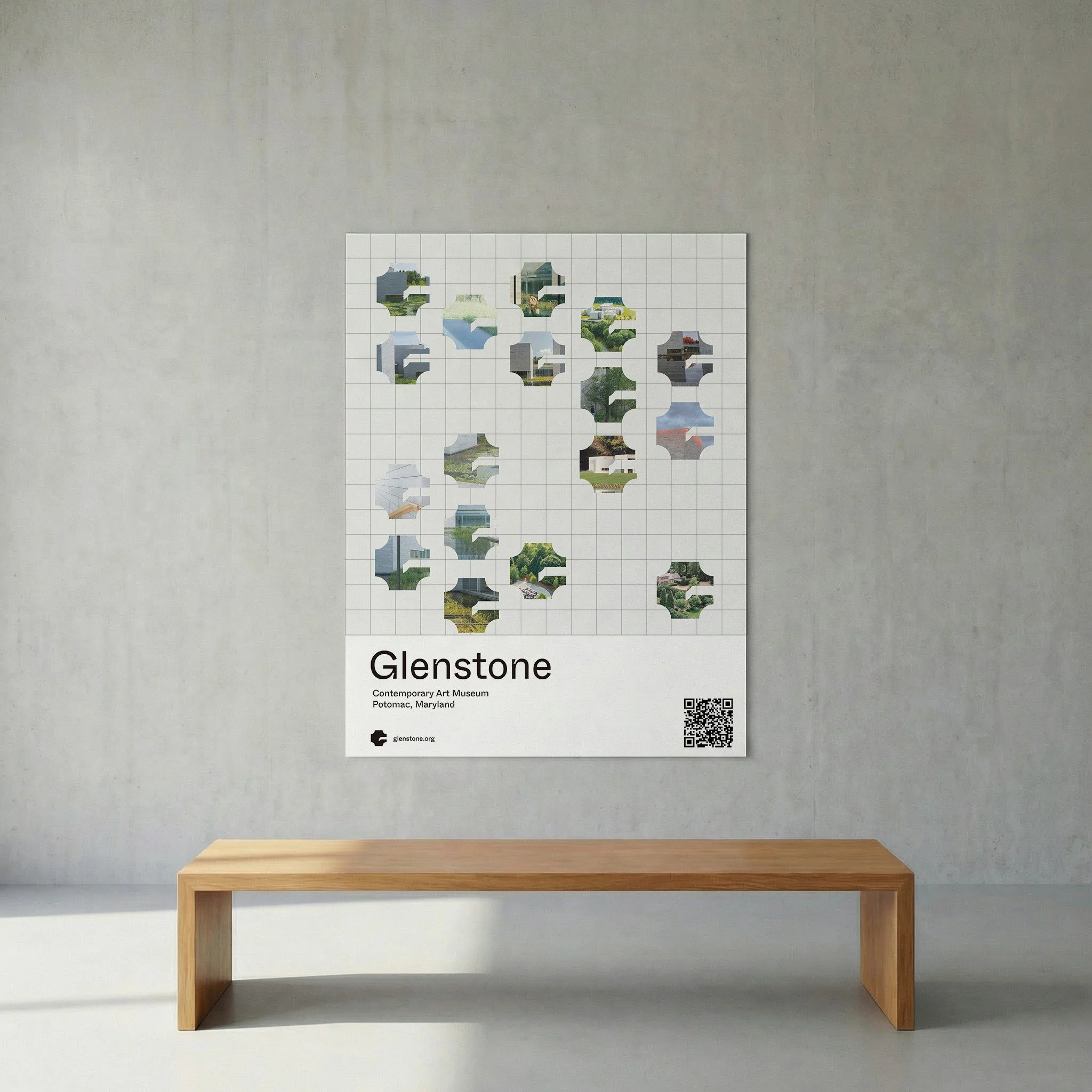
Glenstone Museum Identity, Poster, 24×36 in, 2026 © Yinxue Zou
Your background combines interior architecture and graphic design. How do these two disciplines continue to inform each other in your practice?
Architecture has always informed my design process more than any other subject. Learning how to think about architecture trained me to think about space, movement, proportion, and the body instead of just pictures on a page. Even if I’m working on a single page or poster design, I still think of it spatially: how a reader enters the page, where their eye naturally moves across, where content pauses and asks them to linger.
Approaching design with an architectural lens has made me hyper-aware of structure, hierarchy, and scale. Whether it’s a book, a visual identity, or a wayfinding system, the design is never just individual posters or spreads; it creates a continuous experience. Typography changes size depending on distance from the book, information density can vary depending on the medium, and visual systems adapt to adhere throughout an entire campus or museum.
Interior architecture and graphic design work really well for me in tandem. Architecture taught me about physical experience and moving through space, while graphic design allowed me to more finely tune my eye for language, symbols, and information systems. Having both allows me to see design as a way of organising experiences, not simply applying style.
You often describe your work as building “legible systems.” What does clarity mean to you, and when do you choose to challenge or complicate it?
To me, clarity is not about simplicity or stripping away complexity. When I think about building something with clarity, I think about making the relationship between information visible. The viewer may not understand every single piece walking into a space or opening a book, but they should know where to start, what to read next, and how one section or idea relates to another.
I like to think about clarity as structural honesty. It allows for complex content to exist, but also provides people with an entry point. Especially in branding, publishing, or cultural projects, clarity also allows a system to be repeated, be understood by multiple audiences, and stay consistent across multiple formats.
That being said, I do not think everything needs to be clear. When I’m designing around less concrete concepts like memory, identity, anxiety, migration, or cultural translation, I often find that too much clarity dulls the emotional reality of those experiences. In that case, I may use collage, fragmentation, layering, or non-linear reading paths to create what I consider “accessible complexity.” Through awards, exhibitions, and publications, I have also learned that clarity does not mean being stylistically conservative, and complexity does not have to equal confusion.

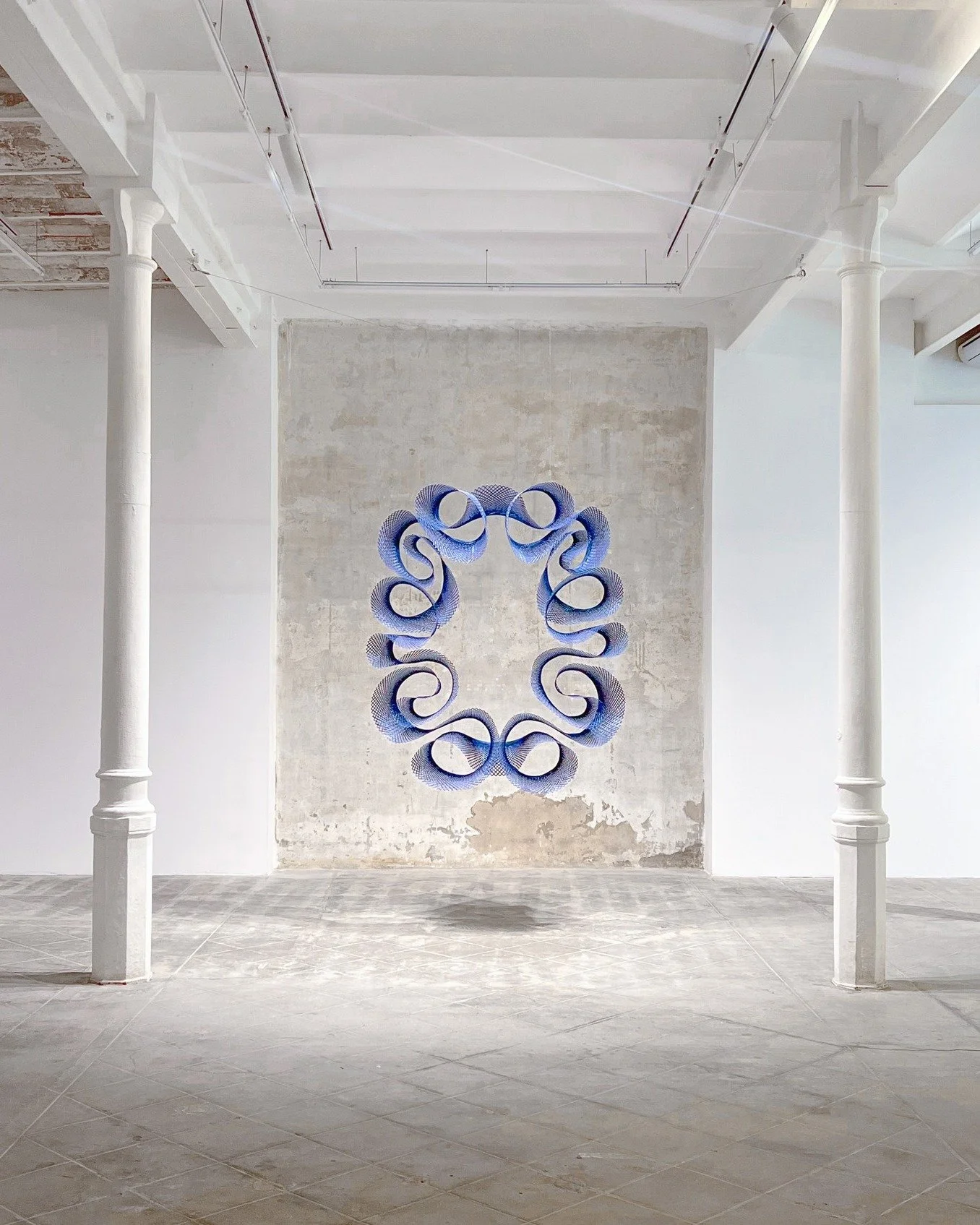
Glenstone Museum Identity, Wayfinding Signage, Variable dimensions, 2026 © Yinxue Zou

Glenstone Museum Identity, Ticket Design, 3×7 in, 2026 © Yinxue Zou
Your projects move between print, digital, and spatial environments. How does your creative process shift when designing across these different platforms?
Whether I am working in print, digital, or spatial environments, my process is fairly consistent. I start with concept, structure, and system. What tends to change with multifaceted projects is how I think about function. Someone reading on a piece of paper is not going to have the same experience as reading on a screen or navigating physical space. The design needs to adapt to those behaviours.
For print, I spend more time considering materiality, scale, paper selection, sequencing, and how the physicality of the book impacts reading rhythm. Digital work often needs to communicate at much faster speeds, adapt to different screen sizes, and capture limited attention. Environmental designs need to react to distance from the viewer, lighting, how people move through space, and even the time of day. Wayfinding, for example, should not only create a visual resolution, but should also be able to be understood while a person is walking.
Working across platforms has become a large part of my practice. Whether it’s a cultural identity, book festival system, event visuals for my internship at Radiate, or even past jobs in-house, I’m constantly challenged with taking one visual idea and translating it across multiple formats. Every strong system needs a stable foundation, but it also needs some flexibility in order to adapt.
You’re interested in interpretation, navigation, and understanding, as you mention in your statement. What first led you to these themes, and how have they evolved over time?
My obsession with how we interpret, navigate, and understand information first came from learning how to exist between languages and cultures. At a young age, I learned that information is not simply something you encounter and understand. The same word, image, or symbol can change meaning completely based on the way it’s used.
This really inspired me to look deeper into translation. Translation is something we do as language learners every day, but it can also happen visually, culturally, and spatially. Designers are constantly translating difficult ideas or large amounts of content into something more accessible for others to understand. That translation requires you to make decisions about what to focus on, what to simplify, what to leave open, and how to guide your viewer.
As I grew, my interest in translation turned into a focus on public and cultural systems. In a museum, book fair, educational program, or public-facing event, you are not simply decorating the content; you are providing people with a way to access that system. I have also written and been interviewed about visual storytelling, cultural identity, and cross-language experience, which has helped me better understand and articulate my design process.

How Do You Pronounce Your Name, Visual Communication Project, 24x36 in, 2026 © Yinxue Zou
Much of your work engages with cultural institutions and public systems. What responsibilities do you think designers have when working within these contexts?
I think design has an incredibly large responsibility when it comes to education and community-building. Whenever we approach a cultural institution or public system, we are relying on the design to communicate accurately, guide us through that space, and often decide if we feel welcomed or not.
Design in these contexts is more than applying style to content; it’s building a usable and trustworthy system. Because of the amount of information cultural institutions can contain (knowledge, memory, history, public education), I do not believe design can simply be surface level. Designers need to consider if the information is clear, if the hierarchy is accessible, and if someone from a different background can understand how to access that system.
This is part of the reason I am interested in teaching workshops and working with people. I have facilitated visual storytelling, collage, and publishing workshops for students and community members. I have also judged youth arts programs. Taking the time to teach others about design reminds me that design is for everyone, not just a professional audience. Good design can help people understand how to navigate our world, but it can also help people express themselves and organise their own ideas.
You’ve said you’re more interested in the functionality of design than style. How do you balance restraint with experimentation in your visual language?
Above all, I care about whether or not something works. But that doesn’t mean I don’t enjoy playing with style. I think the most meaningful experiments in design come from a project’s concept or function, not just how something looks or hoping it will be perceived as ‘novel.’
That being said, my restraints usually come from the system I set for myself: grid, hierarchy, limited type styles, and consistent proportions. These elements are what make my work feel reliable and easy to understand. From there, I will usually let my experiments happen within that system through image treatment, texture, added rhythm, material contrast, or an inspired visual metaphor drawn from the content.
To me, restraint and play are not two things that oppose each other. In many ways, restraint can make your experiments that much more powerful because there is something familiar to hold onto. Play can also stop a system from feeling too cold or rigid. Design awards have also taught me that your work does not need to be visually loud to be good; international projects recognise great concepts with strong logic just as much.

Bad Design Club, Poster, 24×36 in, 2026 © Yinxue Zou

Speechless Narrative, Poster, 18×24 in, 2026 © Yinxue Zou
Can you walk us through a recent project, from initial concept to final outcome? Where did the biggest challenges, or surprises, emerge?
One of the latest projects I have been working on is an extension to my Glenstone visual system. Glenstone is a cultural institution that prides itself on its quiet atmosphere, relationship to architecture, and natural landscape. Rather than creating a more expressive or decorative identity, I wanted to build a visual system with a similar low-density feel and strong consideration for space.
I ended up developing this system further into an evening extension, Glenstone Summer Evenings. This posed an interesting challenge as the extension needed to feel cohesive with Glenstone but also required a warmer, more direct tone to guide visitors at night.
For me, the biggest challenge was identifying how much to change. If I changed too little, it would not feel like its own experience. If I changed too much, it would not feel connected to Glenstone. By adjusting colours to become warmer, modifying image atmosphere, strengthening wayfinding systems, and altering information hierarchy, I was able to make the system feel simultaneously continuous and unique to its evening context.
Is there a specific project that feels particularly meaningful or defining for you at this stage in your career? What makes it stand out?
I would say the Boston Book Festival visual system was a huge step in solidifying my design approach. This project helped me transition from designing a single visual outcome to designing an entire system that could be deployed in many ways. A book festival isn’t solved with one poster; it includes authors, readers, talks, urban space, publications, online communications, and so much more.
For me, that project was about creating a flexible system grounded in books, reading, and urban culture. That system could adapt from the core identity into social media posts, schedules, signage, merchandise, and even digital templates. The Boston Book Festival visual system helped me learn that a successful system is not just about everything looking the same. It’s about organising large amounts of information in a way that feels unified and flexible.
This project later went on to win an Indigo Design Award Gold Winner, which made it extremely special to me. It confirmed that my personal interests in clarity, systems, and narrative could turn into an award-winning design that was recognised internationally. It also helped me learn how to better define myself as a designer who is interested in systems, storytelling, and public-facing design.

Boston Book Festival, Identity System, Variable dimensions, 2026 © Yinxue Zou
Lastly, looking ahead, are there new directions, formats, or contexts you’re interested in exploring that might push your work in unexpected ways?
I hope to continue my practice in ways that challenge graphic design to exist within more complex systems and environments. I love that graphic design can exist across so many areas, and I’m interested in how it intersects with things like space, education, digital publishing, and culture. I continue to be drawn to cultural institutions, publishing, art and exhibition design, or public projects because they impact how we actually experience the world around us, not just how it looks.
One of my big goals moving forward is to design more dynamic and responsive systems. Our information world is constantly changing and shifting, so design can act as more than a singular outcome. Design can be a tool that responds to content, time, geographic context, or how we use it.
Artist’s Talk
Al-Tiba9 Interviews is a curated promotional platform that offers artists the opportunity to articulate their vision and engage with our diverse international readership through insightful, published dialogues. Conducted by Mohamed Benhadj, founder and curator of Al-Tiba9, these interviews spotlight the artists’ creative journeys and introduce their work to the global contemporary art scene.
Through our extensive network of museums, galleries, art professionals, collectors, and art enthusiasts worldwide, Al-Tiba9 Interviews provides a meaningful stage for artists to expand their reach and strengthen their presence in the international art discourse.