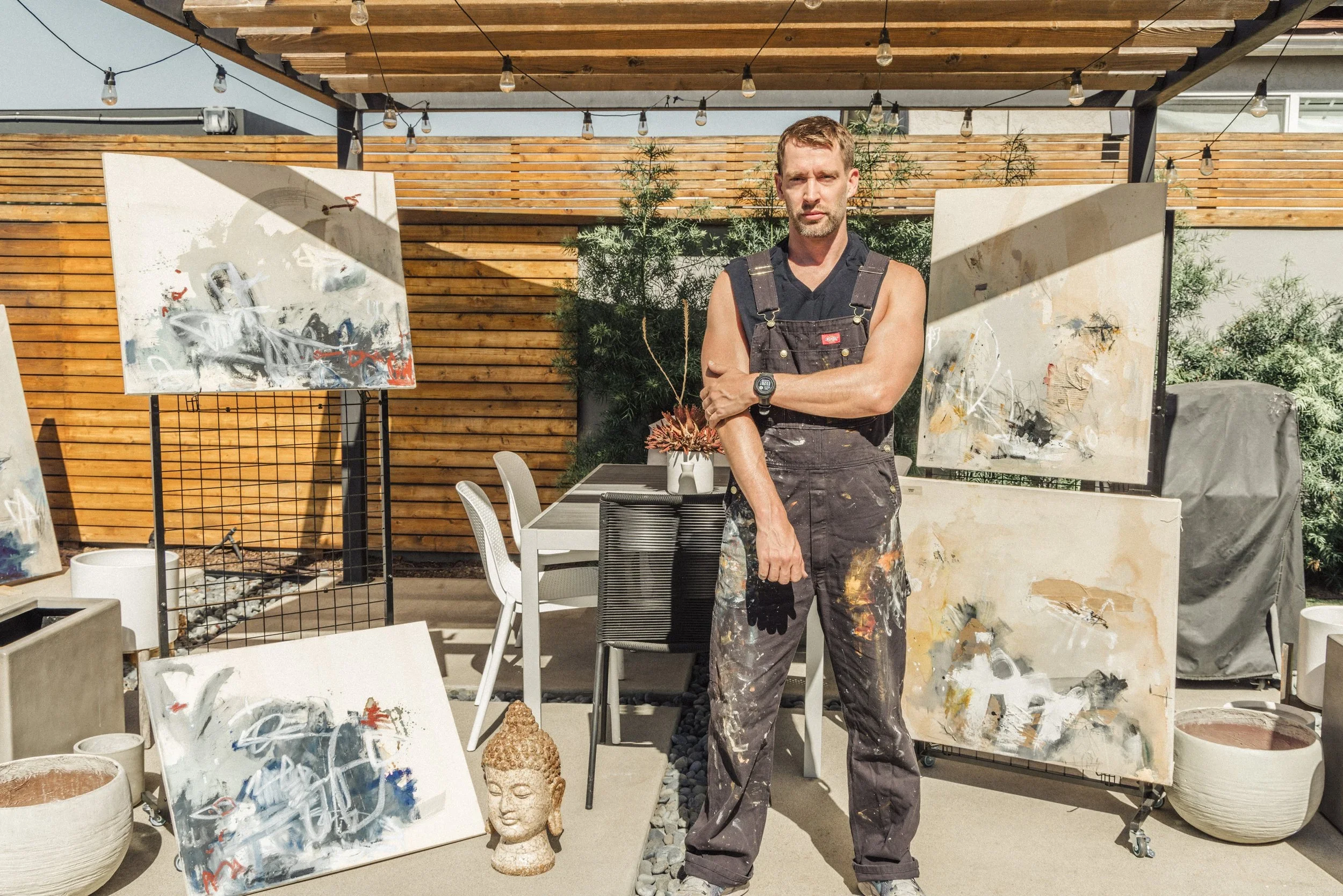
10 Questions with Kan Pitichaichan
Kan Pitichaichan is a Thai-Japanese artist currently studying Fine Art at Parsons School of Design. Born and raised in Thailand, he spent nine years living in London before moving to New York for his studies.
Initially working mainly with painting, Kan used the medium to explore personal themes connected to culture, place, and memory. After being awarded the opportunity to exhibit at Godalming Museum in the UK, he was accepted into Parsons, where he continues to grow as an artist.
Now based in New York, Kan is expanding his practice beyond painting and exploring new forms such as mixed media and installation. His work remains grounded in his experiences across different countries and cultures.

Kan Pitichaichan - Portrait
The Non-United States Flag | Project Description
This project examines the symbolic significance of the American flag and its role as an object of faith. On the surface, it represents unity, patriotism, and national power. However, this work seeks to expose the systems and ideologies operating beneath that surface. Constructing the flag from materials sourced outside the United States raises questions about what it means to claim national identity through objects of global origin.
Inspired by the form and mechanics of fire hoses, the stripes are first sewn together, then painted with Sriracha-dyed cotton sourced from China or foreign daffodil-infused gesso, and finally sewn again in book-like folds. The piece begins as a standard 3x5-foot flag but can be expanded to 10 feet, physically echoing the idea of unveiling or exposing hidden truths.
The engraved tariffs, 49 in total, are not decorative but integral. They reflect economic policies that reinforce exclusion and control, challenging the narrative of the U.S. as a land of opportunity. The flag becomes a site of tension between surface symbolism and hidden practice. While the stars and stripes suggest equality, the hollowed stars and obscured tariff list signal a more fractured reality.
Excerpts from Michael McClure’s Poisoned Wheat are sewn beneath each stripe, invisible at first glance. These lines, like “The last sentry at the gate has pressed the muzzle to his forehead and pulled the trigger”, speak to systems in collapse beneath the illusion of stability. Meaning is not immediately accessible; it must be uncovered, just as the complexities behind national symbols must be actively interrogated.
The Non-United States Flag, Sriracha dye on cotton (China), Japanese selvedge denim, 3x5 ft, 2025 © Kan Pitichaichan
INTERVIEW
First of all, can you tell us about your journey so far, from growing up in Thailand and living in London to now studying in New York?
Coming from parents who are business, IT, and programming consultants, you’d expect me to naturally follow in their footsteps. But while my parents were at work, my grandma would babysit me, and we’d spend hours drawing together. I think seeing how much I loved it made my business-oriented parents supportive of my creative path. It was a very Thai educational system experience, like basket weaving or traditional crafts, but painting was never something I had open access to growing up.
Living in London changed everything. I was fortunate to attend Charterhouse, where I didn’t have to worry about affording materials; canvas, paper, and paints were all provided by the school. I had incredible teachers like Mr. Monkman and Miss Pinkney, who guided and challenged me. We had life drawing every week, and I fell in love with the process all over again. That environment pushed me to work even harder.
Coming to New York was another shift. I wasn’t given the same resources, and I didn’t feel as connected to my professors as I did in England. Honestly, I was somewhat underwhelmed, especially knowing I was paying even more for my education. But that challenge made me hungrier. I became more determined to push through and make the most of what I have right now, as spoiled as that sounds.
Has studying in New York changed the way you approach your work or the themes you explore?
Yes, it has very much changed the way I approach my work and themes. In England, the structure was looser, more of a vague guide from your teacher, and you had more time to figure things out and feel your way through. At Parsons, you’re usually given a specific prompt and much less time to respond to it. It’s both a blessing and a curse. I really enjoy the challenge and the routine; it pushes my thinking, but if it’s something I’m deeply invested in, I do find myself wishing for more time.
I also think part of growing up as an artist is learning to look beyond yourself. I’ve started moving away from portraits and toward work that explores subjects I don’t personally relate to, things that challenge me rather than reflect me.

The Non-United States Flag, Sriracha dye on cotton (China), Japanese selvedge denim, 3x5 ft, 2025 © Kan Pitichaichan
What first inspired you to move from painting to mixed media and installation?
Honestly, I think I fell into the comfort of painting at first. In England, art for me was more traditional, focused on painting, fresco, canvas, panel, and oils, so I had to be as experimental as I could within those limits. But coming to Parsons and New York, I saw it as a challenge to push myself further and explore how experimental I could be with all the resources available.
Also, the fact that I am a younger artist means that I feel there’s a lot of room to grow and explore new forms of art. Seeing incredible works like Rosa Barba’s The Ocean of One’s Pause at MoMA is just one example of the possibilities that showed me what lies beyond painting, especially in mixed media and installation.
Your recent work focuses on the American flag. What drew you to this symbol as a subject?
As someone who isn’t from the U.S., I’ve always viewed the American flag as this highly patriotic, almost imposing symbol of authority. It’s hard not to think of Jasper Johns’ Flag (1954–55) when reflecting on that abstraction and adding to the flag. But for me, I was especially inspired by Hank Willis Thomas’s Stars and Bars. His use of decommissioned prison uniforms to reconstruct the flag transforms it; it still clearly reads as the U.S. flag, but the materials force you to rethink what it represents. It becomes something personal, something redefined, to an outsider.
That approach really resonated with me and became the foundation for my piece. In many ways, it felt like a kind of self-portrait, specifically of my time living in the U.S. It raised the question: “What does the American experience mean to Kan?”
I’ve never made work with an explicitly political undertone before, but seeing how businesses, families, and especially immigrants have had to navigate issues like ICE made me feel the need to respond, to express what was bothering me through my practice.
There was also a layer of irony I wanted to explore. I imagined the piece ending up in someone’s home, being proudly displayed as a patriotic symbol, without them realising it’s actually a critique that could open up to 10 feet long.

The Non-United States Flag, Sriracha dye on cotton (China), Japanese selvedge denim, 3x5 ft, 2025 © Kan Pitichaichan

The Non-United States Flag, Sriracha dye on cotton (China), Japanese selvedge denim, 3x5 ft, 2025 © Kan Pitichaichan
You use unexpected materials like Sriracha-dyed cotton and foreign gesso. How do you choose these materials, and what do they mean to you?
Originally, I was considering creating the piece through patchwork or collage using silk or sateen. I was inspired by Thai boxing attire, the shiny, colourful, silky shorts that feel both playful and proud. But eventually, I thought it would be even more powerful to trick the viewer, to create something so visually uniform and “perfect” that the materials and message are hidden in plain sight. Even the laser-cut text beneath the surface would be painted over. This gave me more control, not just visually, but also conceptually, by allowing me to be specific and intentional in sourcing my materials.
I baked Chinese-sourced Sriracha for hours, crushed it, and infused it with foreign daffodils to create the red and white pigment used for the flag. I painted it on Indian canvas. The blue section was made using Japanese denim, a material now seen as high fashion, but rooted in working-class history, especially in America, where that class is often overlooked.
Underneath it all, I sewed in an Indian-made American army blanket. It represents the irony of outsourcing military goods for cheaper labour while the U.S. simultaneously imposes tariffs on those same regions, almost like shooting yourself in the foot.
I found it funny how these materials, objects of culture, labour, and identity, are so heavily regulated by taxes and tariffs in what’s supposed to be “the land of the free.” I wanted to explore that contradiction and include the reality of immigration in the narrative. After all, can anyone in America truly claim to be “purely” American? Isn’t the foundation of the country built on a mix of people, stories, and places from elsewhere?
The engraved tariffs are an important part of the piece. Could you explain why you included them?
I wanted the viewer to have the ability to literally point at the flag, at each part of it, and, if they really wanted to, calculate how much extra it cost to make this version, compared to buying one off Amazon, which would likely be outsourced anyway.
The blue section is made from removable denim, acting as an index or archive. It invites a closer inspection and makes the flag feel even more intentional.
How do you see the hidden texts, like lines from Poisoned Wheat, adding to the story you’re telling?
Michael McClure’s Poisoned Wheat adds historical and poetic depth to my work, connecting it to the Beat Generation’s radical tradition, a movement strongly opposed to war, capitalism, conformity, and the violence within American society. Written in 1966 as a protest against the Vietnam War, Poisoned Wheat exposes the harsh reality behind America’s claims of democracy and freedom. The passage I included breaks down the illusion of social order, showing how society uses guilt to control people and prevent action, while itself being spiritually dead and self-destructive. McClure’s critique goes beyond government, holding culture accountable for this breakdown.
By constructing the flag from materials sourced from countries affected by Trump-era tariffs, I wanted to create a ritual object of national identity that both reveals and hides this cultural decay. Just as Poisoned Wheat challenged performative patriotism during the Vietnam War, my piece critiques today’s nationalist nostalgia and protectionism, both of which mask a deeper societal collapse. The foreign fabrics and hidden texts within the flag echo McClure’s warning that civilisation has spiritually imploded, with tariffs exposing desperation rather than strength.

The Non-United States Flag, Sriracha dye on cotton (China), Japanese selvedge denim, 3x5 ft, 2025 © Kan Pitichaichan

The Non-United States Flag, Sriracha dye on cotton (China), Japanese selvedge denim, 3x5 ft, 2025 © Kan Pitichaichan
What do you hope viewers feel or question when they see your flag installation?
If a foreign person makes an American flag using non-American elements or materials, does the American flag become less American? Would a pure-blooded American take offence if I made it? And how mad could I make them? Would they call me a “terrorist”?
Do you see yourself returning to painting in the future, or do you want to keep pushing into new mediums?
I think, while I’m at Parsons, I should take advantage of all the resources available to me and explore whatever I can. Who knows if I’ll have access to these after university? I know I’ll come back to painting eventually, no matter how long it takes. For now, I’m focusing on staying afloat and experimenting with different mediums.
Looking ahead, are there other symbols, histories, or ideas you’re excited to explore in your work?
I’m definitely late to this, but I want to push forward with the idea of loss through war, especially the Palestinian conflict, and I’m considering working with Kodak Carousel slides for the project.
Artist’s Talk
Al-Tiba9 Interviews is a promotional platform for artists to articulate their vision and engage them with our diverse readership through a published art dialogue. The artists are interviewed by Mohamed Benhadj, the founder & curator of Al-Tiba9, to highlight their artistic careers and introduce them to the international contemporary art scene across our vast network of museums, galleries, art professionals, art dealers, collectors, and art lovers across the globe.